A scatter plot (also known as a scatter plot graph) is a useful tool for data analysts, helping to visually explore and analyze two different data sets. For instance, if you’re comparing the sales results across different sales teams, a scatter plot would allow you to see who was the best (or worst) performing, much like a line chart would.
While you could use Excel to make a scatter plot, another way you can do it is to use the freely-available Google Sheets to make a scatter plot instead. In this article, we’ll explain how to make a scatter plot in Google Sheets, including how to customize it once it’s created.
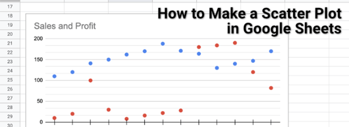
How to Make a Scatter Plot in Google Sheets
A scatter plot, as the name suggests, uses scattered dots across a chart to visualize two or more types of linked data. For instance, if you wanted to compare the sales and profits of a sales team, a scatter graph (showing the profit vs the sales revenue) would be perfect, showing the profit and revenue for each salesperson.
As long as you have two comparable data sets, it’s possible to create a scatter plot, and Google Sheets makes this easy with its chart creation tool.
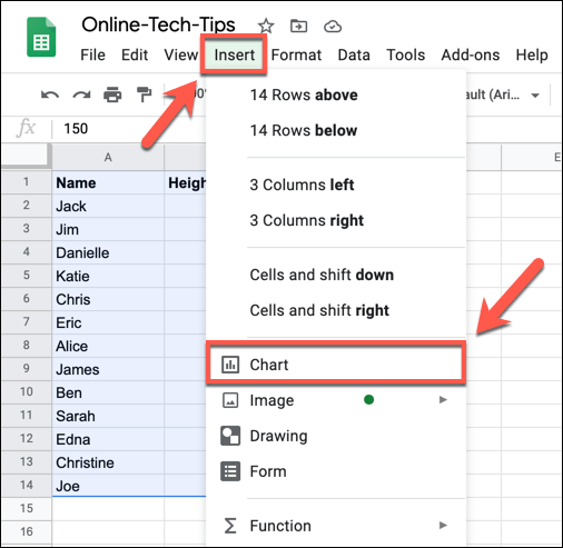
- To create a scatter plot in Google Sheets, open a spreadsheet and select the cells containing your data. With the data selected, select Insert > Chart from the menu.
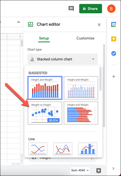
- This will open the Chart editor tool in the right-hand panel. Google Sheets will automatically attempt to determine what type of chart or graph it should use with the selected data. If Google Sheets hasn’t selected a scatter plot automatically, select it from the Chart type drop-down menu, listed under the Setup tab. If you’re unsure what each chart is, hover over it to list the name.
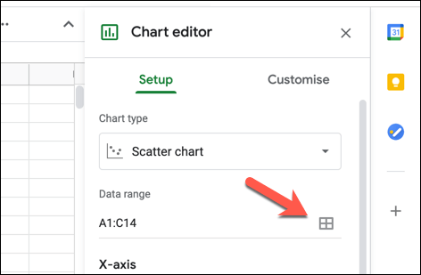
- The chart editor will use the selected cells to form the data range for the plot chart. If you want to change this, press the Select data range button (next to the Data range box). Alternatively, type the cell range into the Data range box manually.
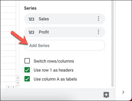
- The inserted chart will immediately update to the new chart type. By default, a scatter plot will have X-axis data that ties the two forms of data together (eg. the names of a sales team). The series will show the two (or more) forms of data that you want to compare (eg. profit and revenue). To add additional series, select the Add Series box and choose one of the additional data sets.
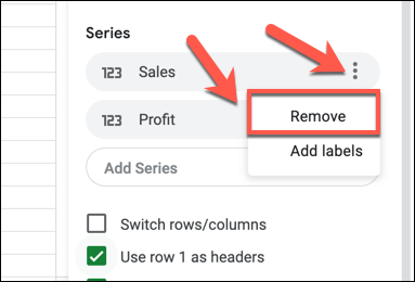
- If you need to remove one of the series, select the hamburger menu icon, then select the Remove option.
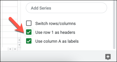
- If you want Google Sheets to use the top row to create header titles, select the Use row 1 as headers checkbox. To use the first column as labels (shown alongside the X-axis), select the Use column A as labels checkbox. You can also switch rows and columns by selecting the Switch rows/columns checkbox.
Customizing a Scatter Plot
Like all charts and graphs in Google Sheets, the chart editor offers a number of additional customization options. This allows you to change labels, axis titles, colors, fonts, and more.
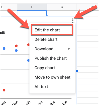
- To customize a scatter plot, make sure that the chart editor panel on the right-hand side is visible. If it isn’t, select the chart, then select the hamburger menu icon in the top-right. From the menu, select the Edit the chart option.
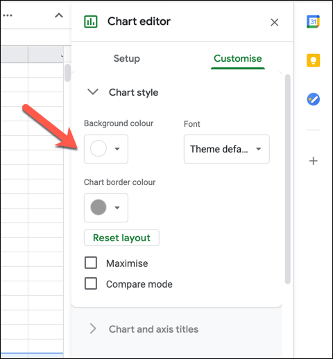
- In the Customize tab of the Chart editor menu, you can begin to make changes to your chart. To change the chart colors and fonts, select the Chart style category and select one of the options (eg. background colour) to make changes. Any changes you make will appear automatically.
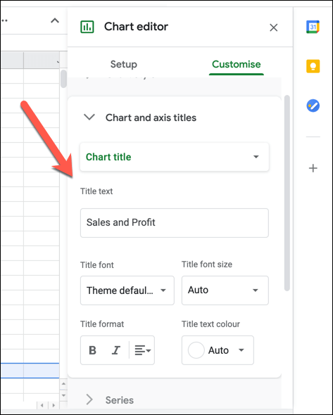
- Under Chart and axis titles, you can change the displayed titles for the chart and chart axes. Select a title option from the Chart title drop-down menu, then insert the text you wish to use in the Title text box. You can then format the text (including font, formatting, and color) in the options below the box.
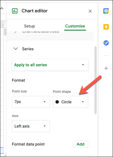
- By default, data points on a Google Sheets scatter plot are displayed as circles. To use a different shape (for instance, triangles or X marks), select the Series category, then choose a new shape from the Point shape drop-down menu. You can also select a new point size from the Point size drop-down menu.
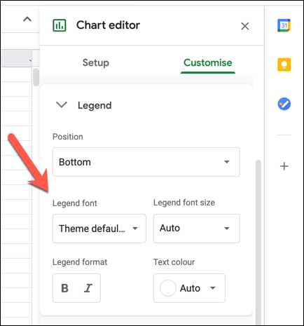
- The legend allows you to identify what data sets the points on a scatter plot belong to. To change the font, formatting, color, and position of the legend, select the Legend category and make changes using the options provided.
- In the Horizontal axis and Vertical axis categories, you can change how the different axis labels are formatted. Select either category, then make changes to the font, font size, formatting, and color from the options provided. If you want to reverse the axis order (from left to right or right to left), select the Reverse axis order checkbox.
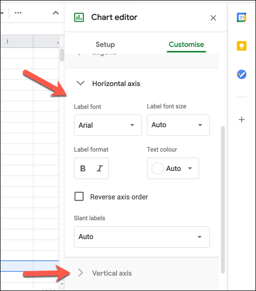
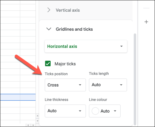
- To help make your scatter plot more visible, you can add gridlines and ticks. To do this, select the Gridlines and ticks category, then select either Horizontal axis or Vertical axis from the drop-down menu. With the Horizontal axis option selected, select the Major ticks checkbox to enable ticks on the horizontal axis, then make further changes to the settings (including position, length, color, and thickness) below it.
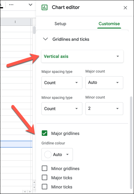
- With the Vertical axis option selected in the Gridlines and ticks menu, you can enable gridlines (both major and minor) and ticks for the vertical axis. Select the Major gridlines, Minor gridlines, Major ticks or Minor ticks checkboxes to enable these options, then make changes to the settings (including color, position, length, thickness, and color) below it.
Create Visual Spreadsheets
Now you know how to make a scatter plot in Google Sheets, you can also experiment with creating other Google Sheets graphs and charts for data analysis, from a line chart to a bar graph. If you’re struggling, there are Google Sheets templates you can use to get started, ready for you to fill with data and create your own charts around it.
Experienced Excel users can also convert spreadsheets to Google Sheets with ease, although some features (like Excel macros) won’t be supported. You can take things even further, using Google Sheets scripts to expand functionality and integrate spreadsheets with other Google and third-party services.