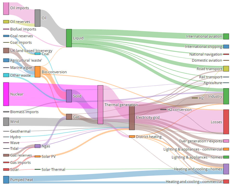
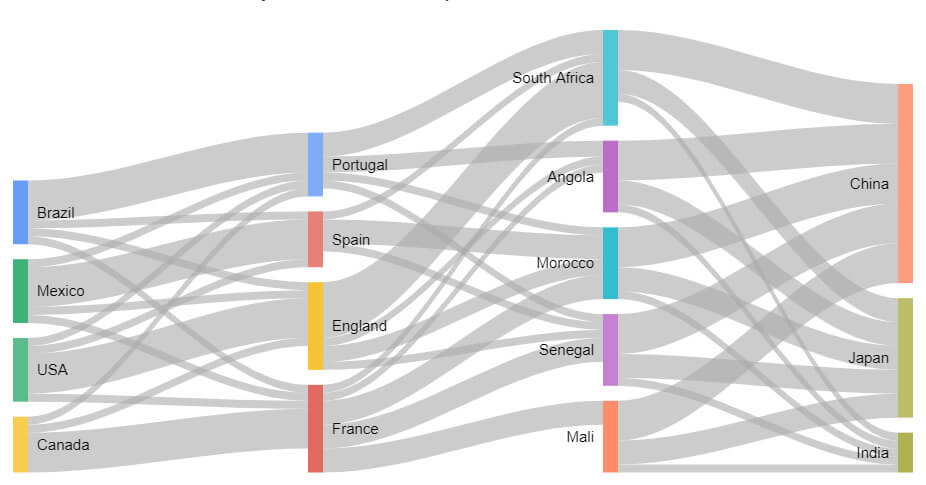
You’ve probably seen a Sankey chart before. Sankey charts (also called Sankey diagrams) are especially useful to show a flow, helping people visualize big transfers within a system. For example, a Sankey chart might show how a resource like money, time, or energy moves throughout a process. Sankey diagrams are also good to show decision trees.
If you want to visually highlight a complex process, consider making a Sankey chart. There are several websites where you can create a Sankey chart. While some rely on users having some programming knowledge, others are accessible to everyone. We’ll look at a few of each.
What Is a Sankey chart?
Sankey charts are named for Matthew Henry Phineas Riall Sankey, an Irish engineer and captain in the Royal Engineers who made a diagram showing the energy efficiency of a steam engine.
To create a Sankey chart you can either learn how to code one yourself or use a web app to generate one.
Websites to Create a Sankey Chart
While some coding knowledge can be helpful, even if you don’t know Python or the programming language R, you can still create a Sankey chart. Some of the websites below have options for people with some programming experience. Most don’t require any programming knowledge at all.
1. SankeyMATIC
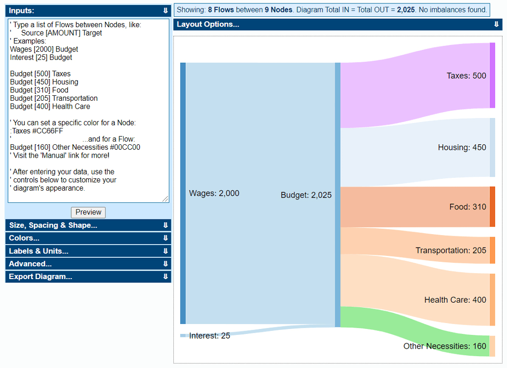
To use SankeyMATIC, you add your inputs, customize your chart’s appearance, and then export it as a PNG image or as vector code (SVG). The input format is simple and easy to understand. The vector code option is nice if you want to import your chart into a program like Adobe Illustrator for additional modification.
2. The Sankey Diagram Generator
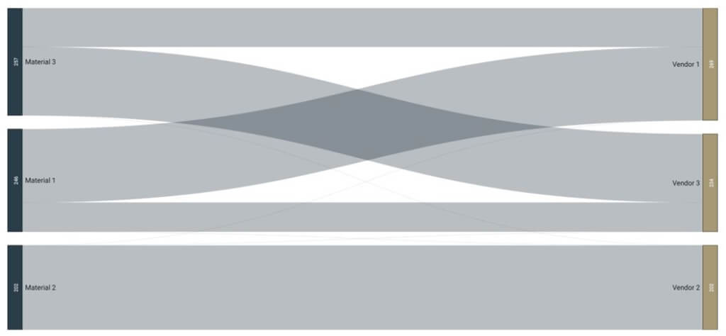
The Sankey Diagram Generator from Acquire is a web app that lets you upload your data in one of three formats:
- JSON
- CSV
- Pivot table
You can adjust the color and size of each flow as well as the decimal places of numbers displayed and the transparency of the flows. When you select the Save button, the site will generate code you can copy and paste. You can also download the image or share it via email.
3. Visual Paradigm’s Online Sankey Diagram Maker
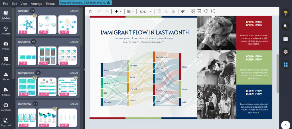
The Sankey Diagram Maker from Visual Paradigm is packed with features. Start with one of their beautiful templates and add your specific data to edit it.
You can change font styles and colors or add photos and icons to make your Sankey chart stand out. This site isn’t free, but you can sign up for a free 30-day trial. After that, it’ll cost you between $4-15 per user, per month.
4. Displayr
Displayr offers a free tool to make Sankey charts. You’ll need to sign up for an account, though. Once you do, you’ll get access to a powerful user interface where you can upload a data set from your computer or from the cloud. From there, you can use an automated layout or tweak it manually.
Displayr isn’t just for Sankey diagrams—you’ll also have access to all kinds of different data visualizations like heatmaps, histograms, and pie charts. Fair warning however, you’ll need a paid account to download the Sankey chart you created.
5. Chartguide
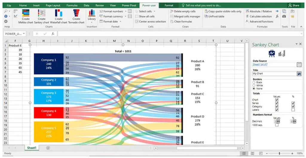
Chartguide isn’t a website where you can create a Sankey chart. Instead, they’ll teach you how to create a Sankey chart using Excel with the Power User add-on. If your data is already in a spreadsheet, it’s worth trying this method to generate Sankey charts yourself without ever leaving Excel.
6. Dénes Csala’s Sankey Diagram Generator
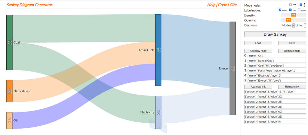
This Sankey Diagram Generator online tool is sleek and simple. Creator Dénes Csala says, “It supports self loops, moving around nodes in both horizontal and vertical directions and loading and saving diagrams!” Users also have the ability to change the opacity and color of the nodes.
It’s clear that this open-source project is a labor of love for its creator. You can also find it on GitHub.
7. Highcharts
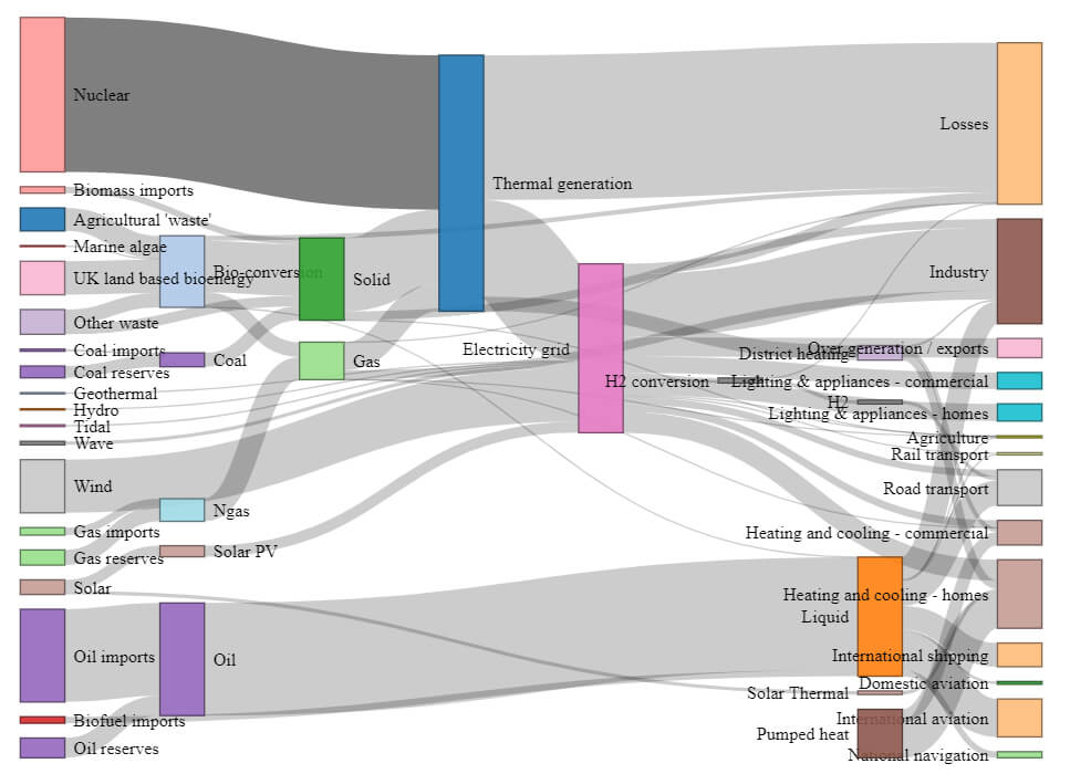
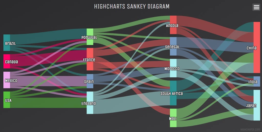
If you want to edit your own code, Highcharts is a great option for creating a Sankey chart. In addition to the ability to enter your data into the simple Configuration Preview, they also offer buttons to edit the code directly in JSFiddle or Codepen.
Similar to the tool from Visual Paradigm, Highcharts gives you access to a wide variety of chart types like gauges, heat and tree maps, and scatter and bubble charts.
8. R Graph Gallery
The R Graph Gallery is a place where you can find nearly 400 charts, all with reproducible code. R is a software environment mostly used for statistical computing, which makes it perfect for creating Sankey charts. It uses networkD3, which is an HTML widget that builds interactive charts.
Find a Sankey chart you like in the R Graph Gallery and then select the Show code link to customize it however you want. The code we looked at was well-commented and easy to follow.
9. Python Graph Gallery
If R isn’t your jam but Python is, then check out the Python Graph Gallery for reproducible and customizable Sankey charts. These charts use the Plotly library for Python which has a function specifically for creating Sankey diagrams. You can also find examples using the matplotlib library which has its own Sankey function. In both cases, if you’re into Python, this is a great resource.
10. Google Charts
The last entry in our list of websites where you can create a Sankey chart comes from Google Charts. It provides an example of and code for a simple Sankey chart as well as one with multiple levels. For each, you can control the colors, customize the labels, and adjust the nodes. Each aspect is well-documented, so you can become an expert on configuration options and the best way to format your data.
Much like some of the entries above, Google Charts offers examples and code for a variety of types of data visualization, so if a Sankey chart doesn’t tell your story the way you want, you can easily try other ways to visualize your data.
