Bar graphs can be extremely helpful when it comes to visualizing data. They can display one set of data or compare multiple data sets.
In this article, we’ll go over how to make various types of bar graphs in Google Sheets.
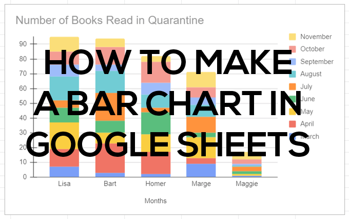
How to Create a Bar Graph in Google Sheets
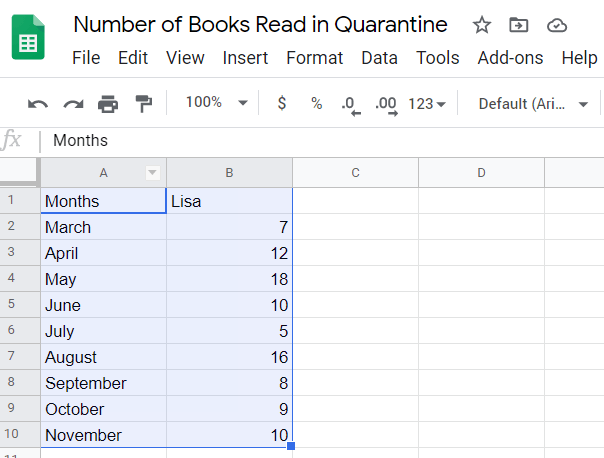
We’ll start with a simple, two-column spreadsheet. In the first column of your spreadsheet, add a label for each row in your series. If you like, you can add a category in the top cell and that category will appear as the title of your graph’s horizontal y-axis. The labels under that category name will appear along the horizontal axis of your chart.
Add at least one column of data. Enter a label in the first cell of the second column, and add the data in the cells beneath it.
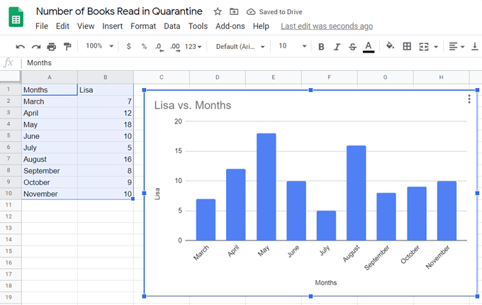
Next, follow these steps to insert a bar graph to represent your data.
- Select all the cells that have data in them.
- From the menu, select Insert > Chart or select the Insert Chart icon.

Whichever method you choose, Google will insert a bar graph into your sheet. (Google calls it a column chart. This is the same thing.)
Making a Bar Graph with Multiple Data in Google Sheets
To make a bar graph that includes multiple sets of data, just add more columns of data.
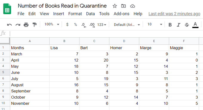
Follow the same steps as above to insert a bar graph representation of your data.
- Select all the cells that have data in them.
- From the menu, select Insert > Chart or select the Insert Chart icon.
Here’s a bar graph that uses multiple columns of data from the spreadsheet above.
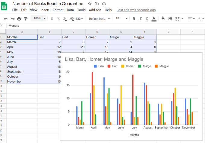
In this case, Google uses the categories in the first row of data as the chart title.
Making a Stacked Bar Graph in Google Sheets
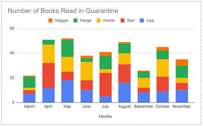
When you use multiple data sets, you can show the part-to-whole relationships in your data by opting for what’s called a stacked bar chart. In our example above, the chart showed how many books each person read in a particular month. If we switch the bar graph to a stacked bar chart, we’ll see how many books each person read that month compared to the total number of books everyone read that month.
There are a couple different flavors of stacked bar charts. First we’ll look at the Standard stacked bar chart.
After you’ve inserted your bar chart, double-click inside it and the Chart Editor panel will appear to the right.
Note: You can always change the chart’s title inside the Chart Editor or by double-clicking on the chart title itself.
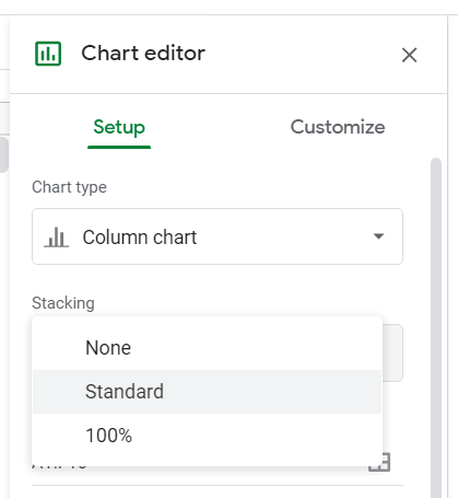
Under Stacking, choose Standard.
Now you’ll see the values of each category stacked into single bars.
Alternatively, instead of Standard, you can choose 100% to make a stacked bar chart that depicts the ratio of individual data to the whole. Use this when the cumulative total isn’t important.
So for our example, we might not care how many books were read in total each month—only how many books each person read relative to other people.
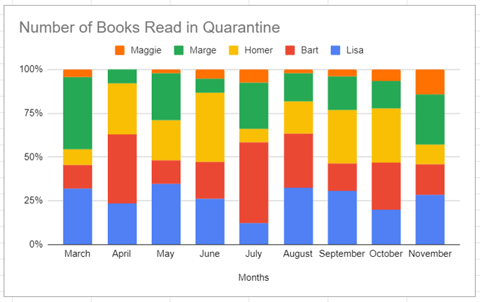
Notice that in the 100% Stacked Bar Chart above, the labels along the x axis are now percentages.
How to Swap Columns & Rows in a Chart
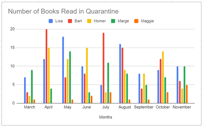
Using our example, let’s say you want to make it easy to visualize how each person’s reading habits changed from month to month. Google Sheets makes it easy to turn your columns into rows and vice versa.
- Double-click the chart or graph.
- Select Setup on the right.
- Check the box next to Switch rows/columns.
Our regular bar graph now looks like this:
If we switch rows and columns on our stacked bar chart, it will look like this:
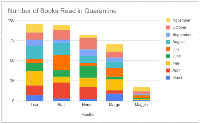
You can see that each of these different options is ideal for telling a particular story about our data. Think about what story you want to tell, and determine which kind of bar graph most clearly makes your point.
Customizing Bar Graphs in Google Sheets
You may have noticed the Customize tab in the Chart Editor.
Select that tab to change the look and feel of your chart. Next we’ll go through each section of the Customize tab.
Chart style allows you to choose the background color, border color, and font for your chart. If you don’t like the changes you made, you can always select the Reset layout button to start over.
Checking the Maximize box will decrease the white space in your chart. Try it and see if you like what you see.
Selecting the 3D box will make your bars three-dimensional, like this:
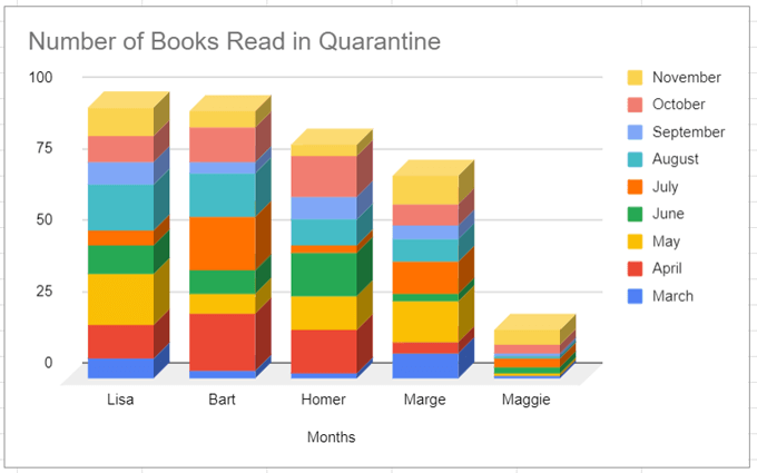
Compare mode will highlight comparable data when you hover your mouse over different elements of your chart. In the chart below, notice how the November data (the top-most section of each stacked bar) is highlighted.
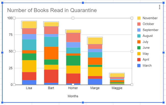
The Chart & axis titles section is another place you can change the chart title as well as its font, font size, format (italics, bold, etc.), and text color.
In the Series section, you can change the appearance of your series labels. In our case, that’s the months and their corresponding parts of the bar graph. For example, you could change the November data from yellow to gray.
You can also format a specific data point like, for example, the data representing the number of books Lisa read in October. Click the Add button next to Format data point, and from there you can change the color of that single data point.
In the Legend section, you can change the legend font, font size, format, and text color.
The Horizontal axis and Vertical axis sections offer similar options for formatting labels on each of your chart’s axes.
Finally, Gridlines and ticks is a relatively new feature (as of June 2020) allowing you to emphasize parts of your axes by inserting tick marks, formatting them, and setting the spacing between them.