You might already be familiar with the ToDoist online time management app for getting organized and improving your productivity. But did you know that there’s a desktop version of ToDoist that’s available for both Mac and Windows PCs?
Before you install the app on your desktop PC, you should know that there are a few pros and cons to using this version.

In this article we’ll go over all of the features that you’ll find in the desktop version of ToDoist, a few of the issues you may come across, and ways to make the best use of this version.
Using The ToDoist Desktop App
To get started, you can download and install ToDoist for your Mac or Windows PC from the ToDoist download page.
When you first launch it, if you don’t already have an account you’ll need to create one. You can sign up with any email address, or sign in with your Google, Facebook, or Apple account.
The first, main page that will appear looks deceptively simple, but there are a lot of useful features hidden under this main page.
The first thing you may notice is that the main page on the desktop app looks completely identical to the online version.
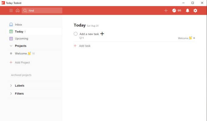
Not only does it look identical, but everything works the same way as well. The menu system on the left lets you view tasks for today, upcoming tasks not yet due, and an area where you can create and organize all of your projects and tasks.
To create a new task, just select the + symbol next to Add a new task and type the description of the task. Press Enter when you’re done, or select Save.
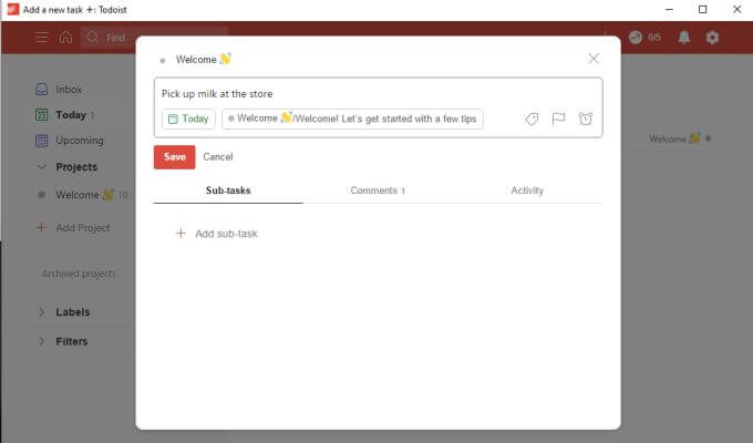
This is the simplest way to create tasks. Tasks default to the Inbox if you don’t assign it to a project. They’ll also default to being due today if you don’t schedule them.
If you do want to get a little more advanced with your task scheduling, there are a lot of options buried inside the task creation window.
Creating Tasks In TheToDoist Desktop App
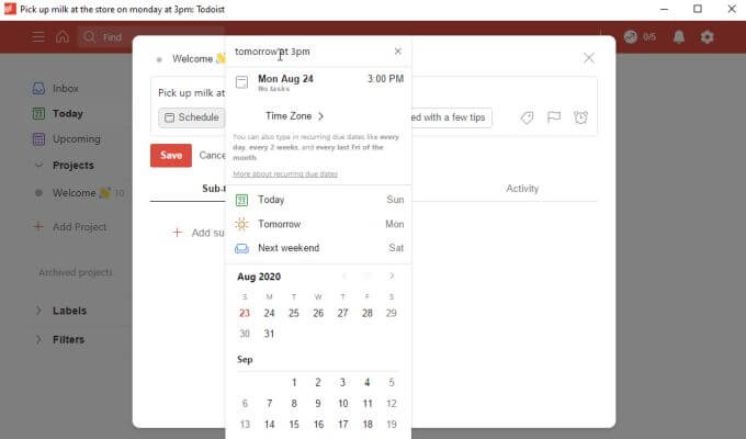
If you want to set an actual date for the task then select the Schedule button under the task name. This lets you use a standard calendar selection to choose the date and time when you want the task to be due.
You can also use the same kind of natural language recognition that’s available on the ToDoist web app. This means in the field at the top you can type something like “tomorrow at 4pm”. ToDoist will recognize what you mean and assign the correct calendar date and time.
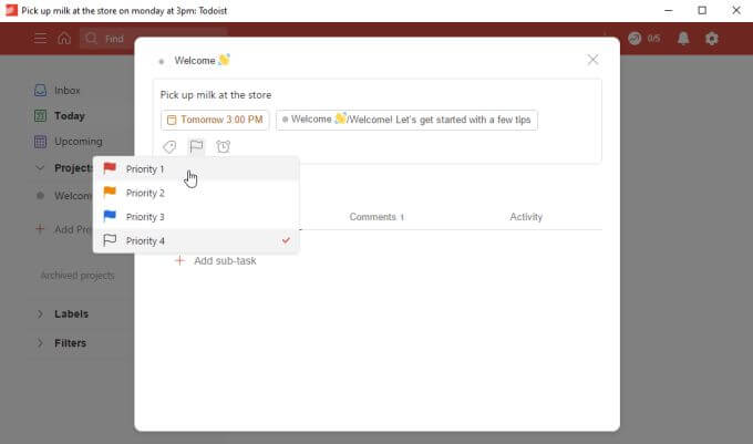
If you select the flag icon, you can apply a priority to the task. It’ll then appear in your list of tasks on the main page with the associated priority color.
One of the most useful features you can use while creating tasks is by planning them out in great detail by adding subtasks.
In previous versions of ToDoist, this used to be nothing more than a basic list of items without any additional details. In the latest version of both the desktop and online apps, these subtasks have all of the same features of regular tasks, including scheduling, flags, and even additional subtasks of their own.
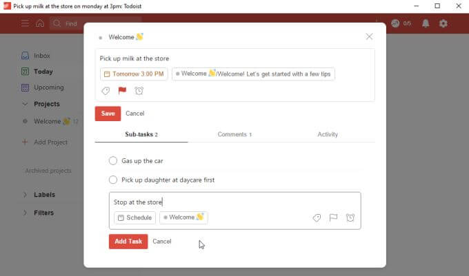
This means that you can make sure you won’t forget the minutia within the larger projects you’re working on.
Unfortunately there are two important features that you can’t use here with the free version.
- Labels: Further organize tasks by applying customized labels. You can sort all tasks by label.
- Reminders: Set an initial date when you want to be reminded to start the task so that you’ll have time to complete it before it’s due.
While it’s understandable that a feature like labels might only come with the premium version, not including reminders in the free version is severely limiting. Especially considering that the free versions of most other apps, like Microsoft To Do for example, includes reminders as a basic task feature.
ToDoist Desktop App Main Page Features
Once you start adding tasks, you’ll see the main tasks with an arrow icon you can press to expand and see the subtasks.
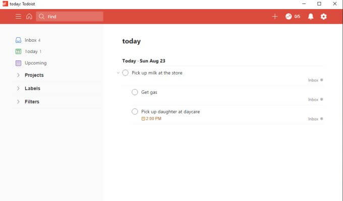
Select Inbox from the left navigation pane to see any unassigned tasks you’ve added. This is a good place to store tasks until you know exactly how you want to organize them.
Select Today to see tasks that are due today. This is likely where you’ll spend the majority of your time during the day, working through your most urgent tasks.
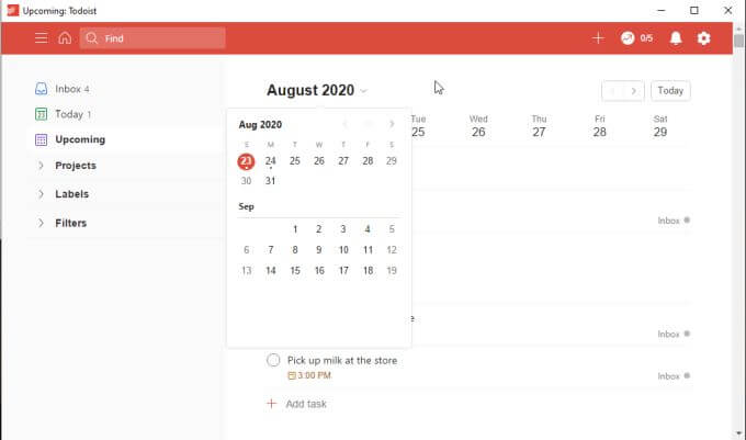
Select Upcoming to see all upcoming tasks that aren’t due quite yet. You can press the down arrow next to the month to shift further back or ahead in the calendar to view tasks that are due much later.
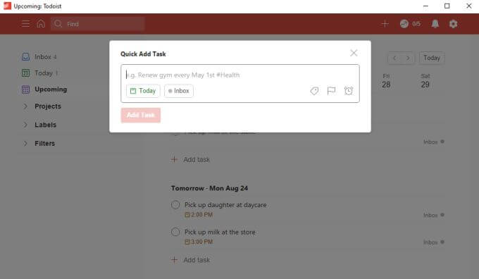
Speaking of the Inbox, you can quickly add tasks there at any time by selecting the + icon at the very top right of the main ToDoist window.
This will open a Quick Add Task window where you can type the task description, set a date, and add a priority. When you select Add Task it’ll go straight to the Inbox so that you can organize it later into the appropriate project.
ToDoist Desktop App: Adding And Organizing Projects
One way that ToDoist excels over other to-do apps is how easy it is to organize projects. This isn’t any different in the ToDoist desktop version.
If you select Add Project from the left navigation menu, you’ll see the Add project window appear. Type the name of the project, add a color that’ll help you identify it at a glance, and select to add it to your favorites list if you like.
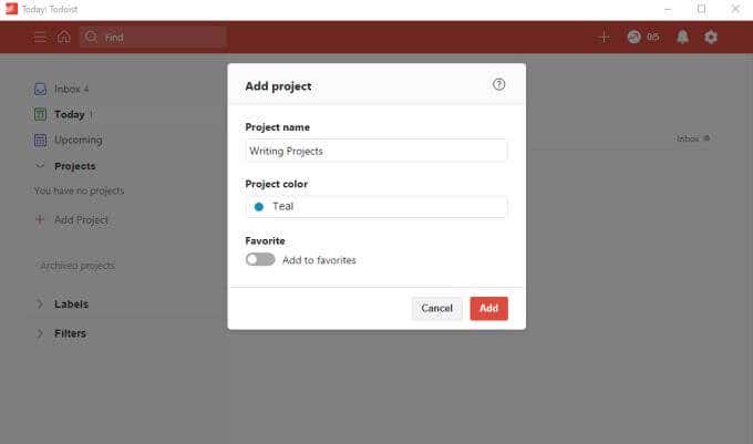
Select Add to finish.
If you want to create a sub-project, just right-click the project you just created and select Add project below.
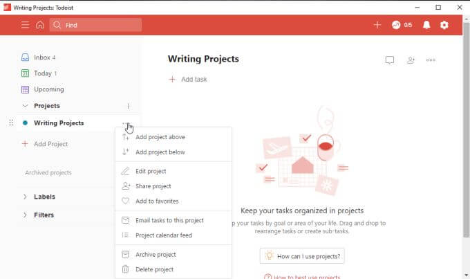
This places the new project just below that one, with an indent so that you can tell that it’s a sub-project under the main one.
You can actually use the same approach with tasks and sub-tasks (as an alternative method of adding sub-tasks). Just right-click a task and select Add task below.
When you’re ready to organize your tasks into projects, go to the Inbox, right-click the task, and select Move to project.
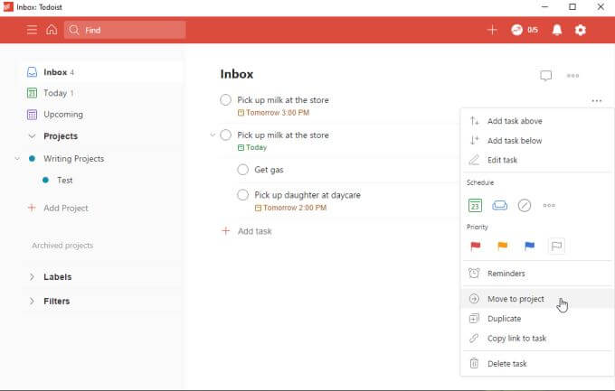
This is a fast and easy way to quickly organize all of the tasks you’ve tossed into your Inbox.
Other Observations About ToDoist Desktop
You will find that as you’re making updates on your ToDoist desktop app, those changes take effect almost immediately on the web version of the app.
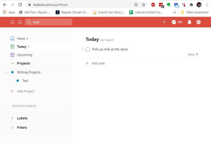
The same is true for any other place you have a ToDoist app installed, such as on your mobile phone or in the browser add-ons (all available from the same download page).
One interesting thing we observed while testing the ToDoist desktop app was that there are still small glitches throughout.
For example if you select the notifications icon at the upper right of the page (the bell icon), you may notice that the dropdown menu stays locked in place. Clicking the notification icon again won’t close it, and there’s no close icon to close the dropdown.
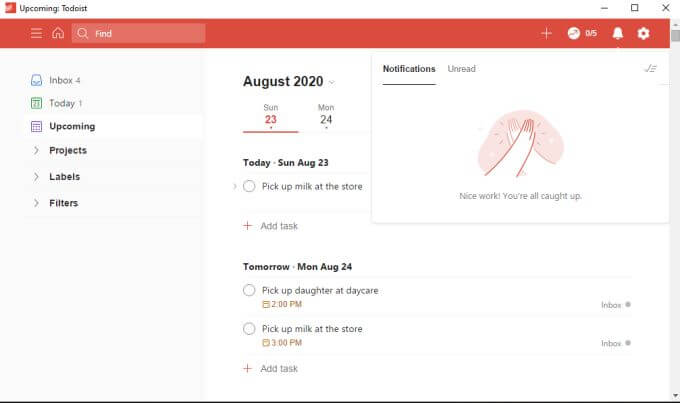
Clicking anywhere else in the desktop app doesn’t close the dropdown either. The only way to get around this glitch is to close the desktop app and reopen it.
You’ll notice this happening occasionally with other dropdown menus as well, like the Settings menu.
Since you may not need to use these frequently, this may only be a minor annoyance, but it’s something that the ToDoist folks should probably fix.
Overall Conclusions
The ToDoist desktop app is useful if you don’t want to use up browser windows with your time management work. Keep the app off to the side and track your tasks as you’re working online.
On the other hand, the desktop app feels like an afterthought. It doesn’t appear to be as responsive as the web version, and finding bugs in what should be a production version of software doesn’t give one the sense that ToDoist developers are doing a good job maintaining their offline app offerings.